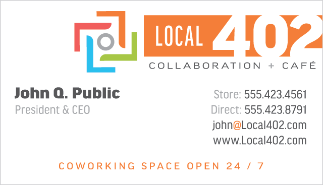
Goal was to create a brand for an up and coming coworking space in Omaha, Nebraska (which is area code 402). This brand was particularly challenging because it had a requirement of not catering to any one particular demographic, industry, or age group. The age requirement specifically was the trickiest obstacle since coworking spaces tend to attract more of a younger audience to them.
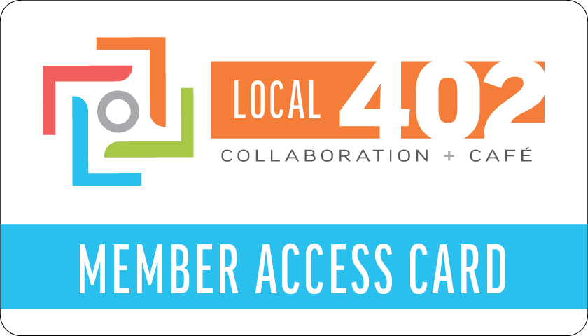
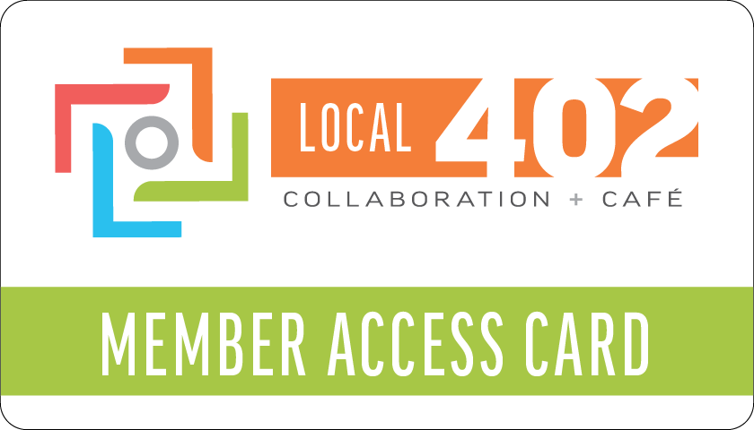
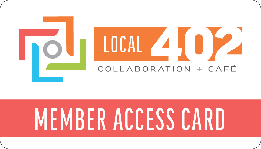
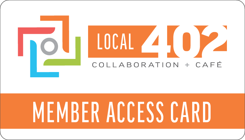
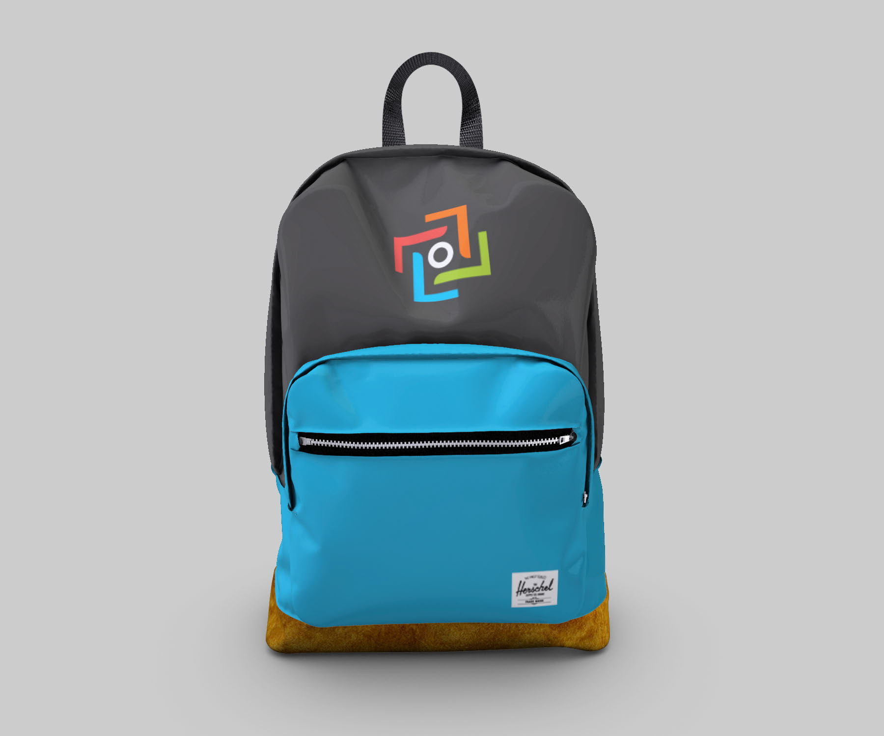
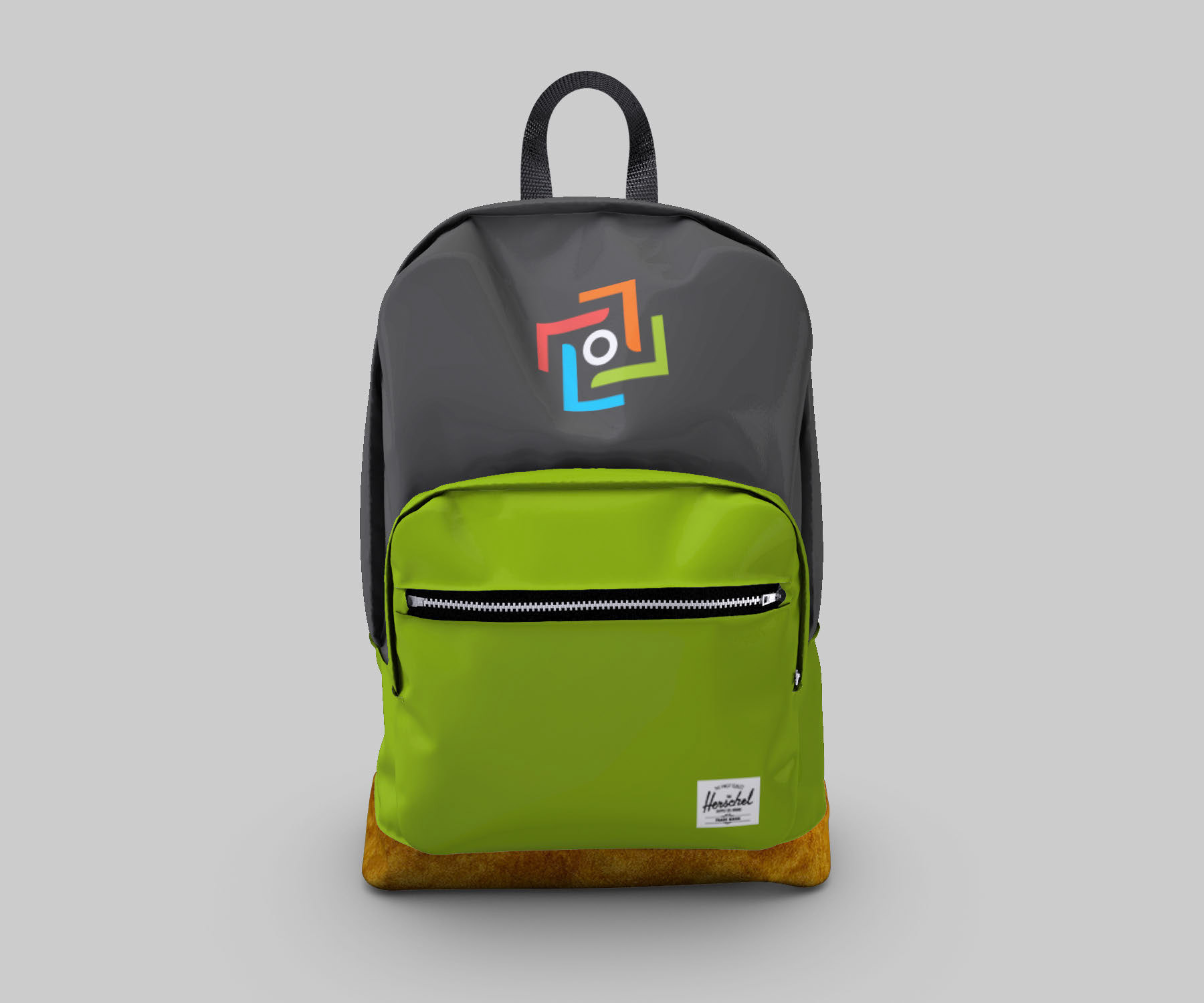
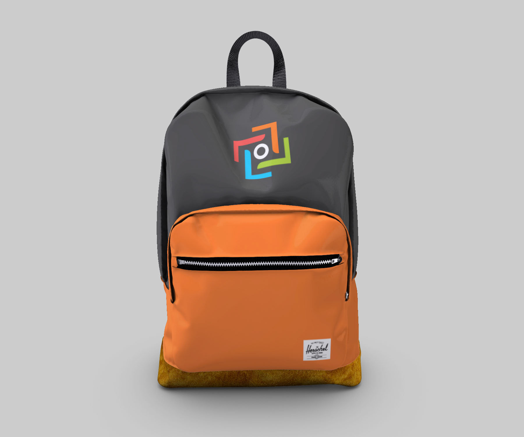
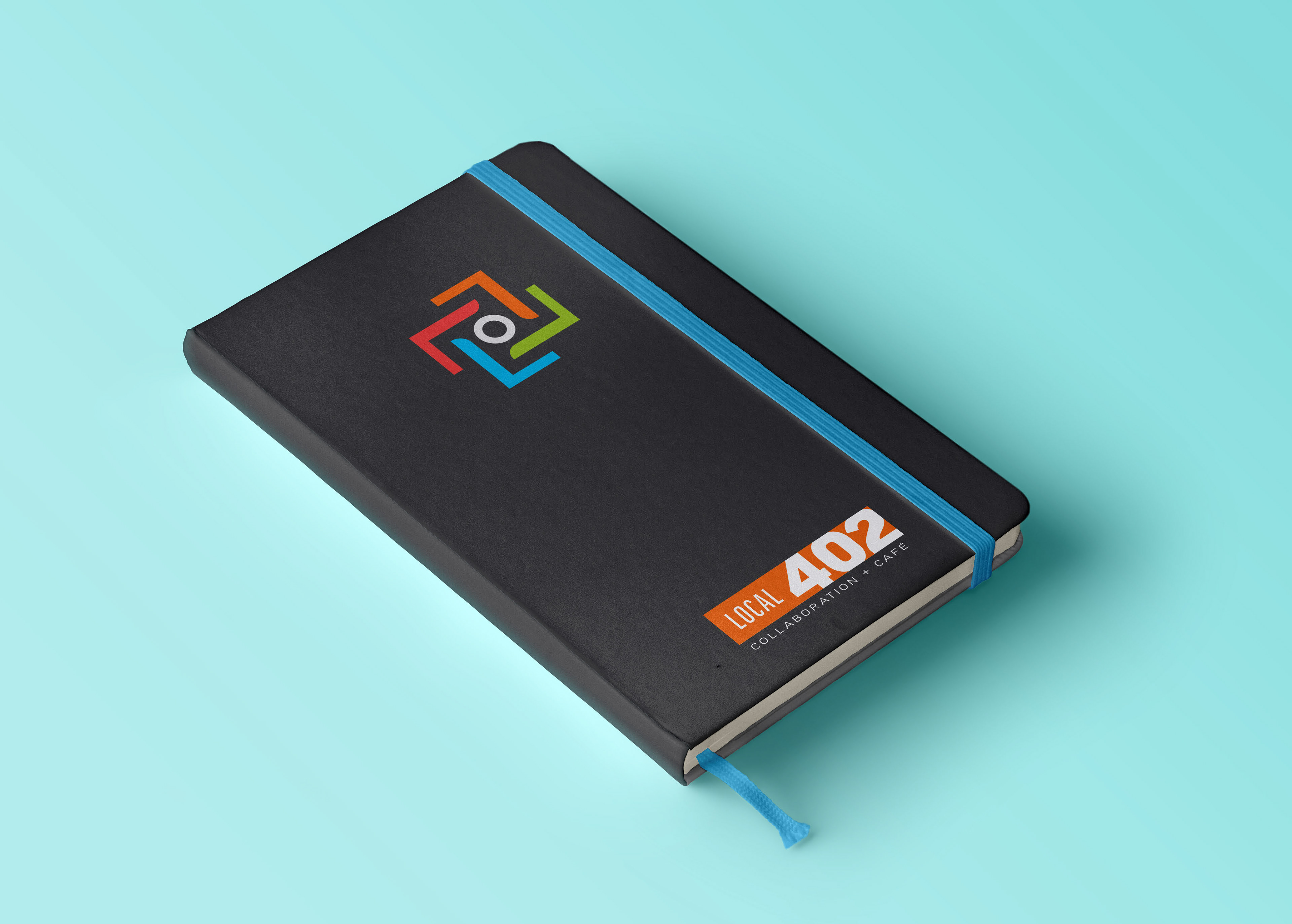
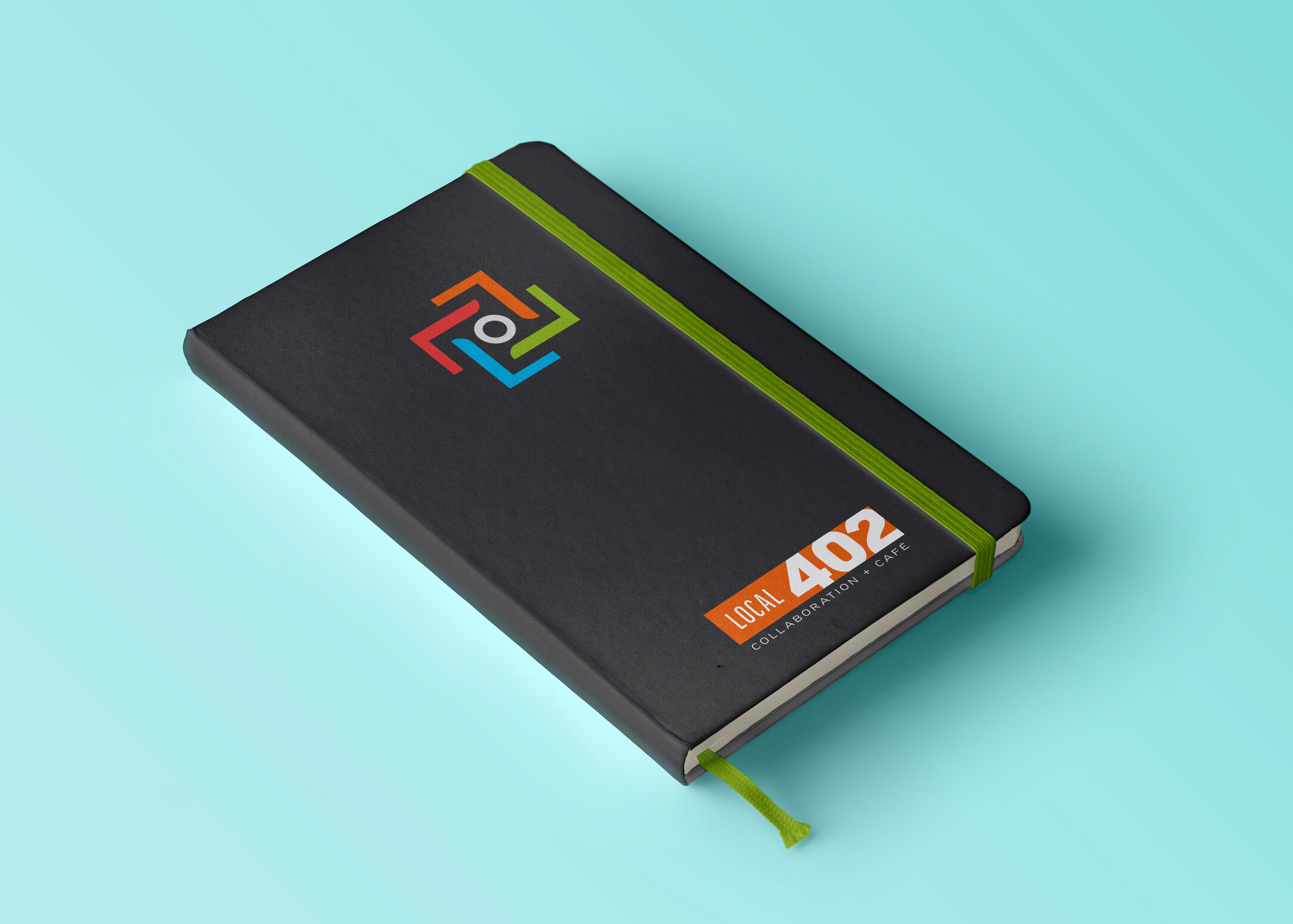
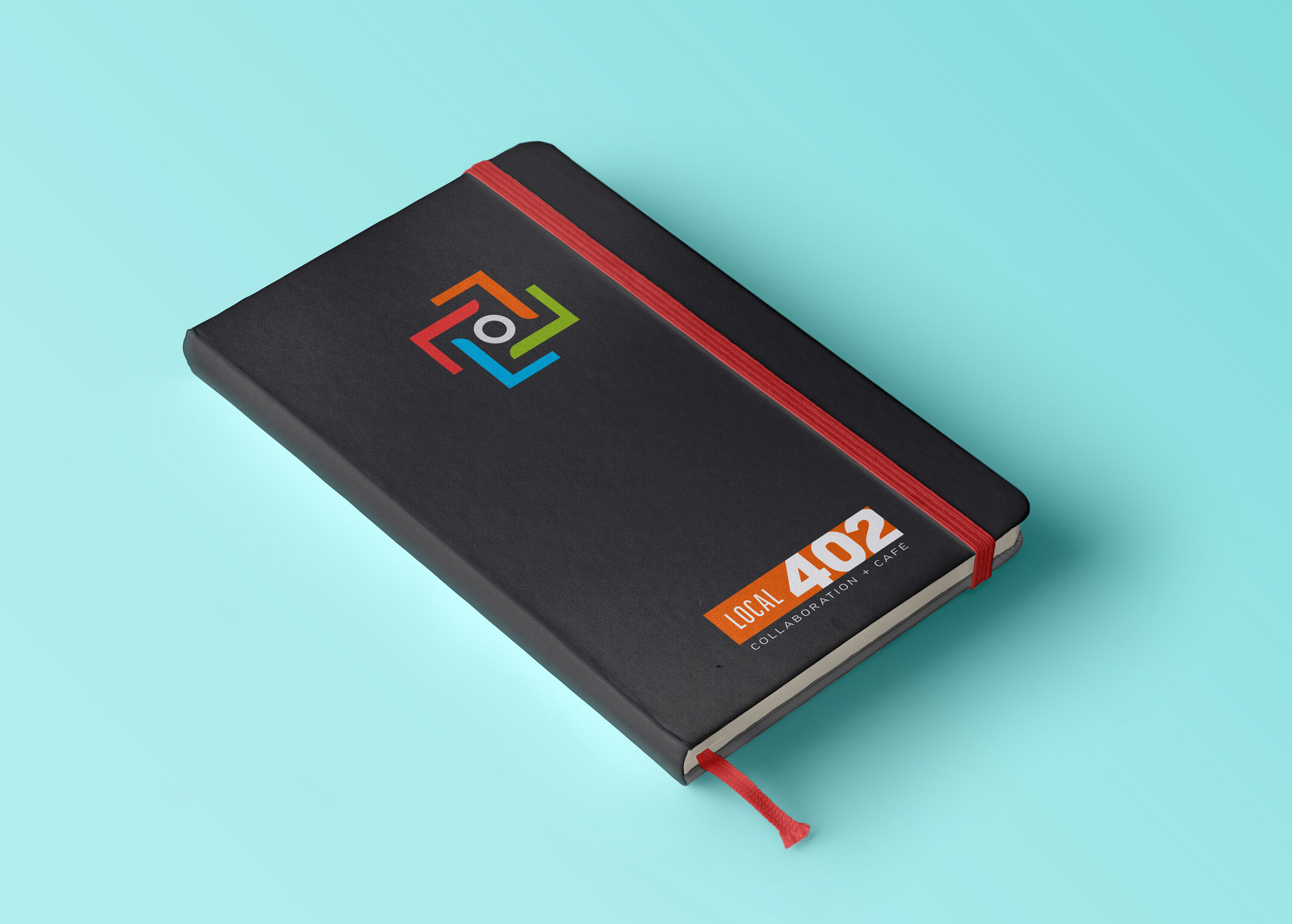
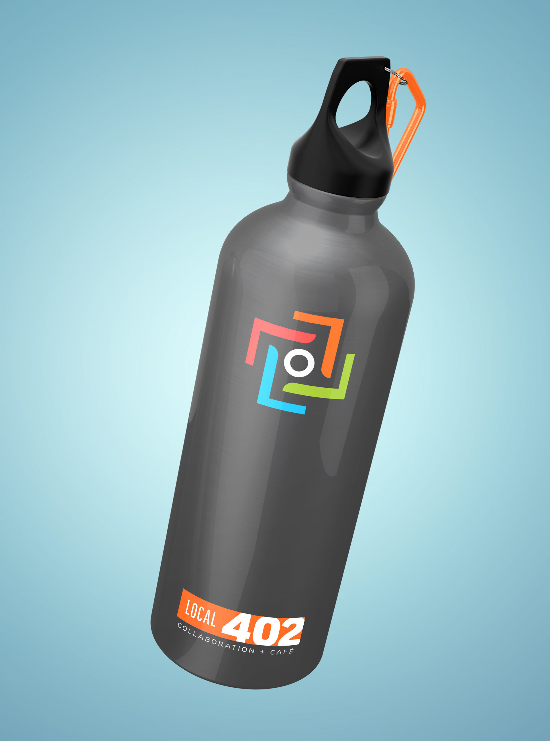
The logo is reminiscent of a group of chairs around a central table – the various colors reflect the myriad of careers that a coworking space is meant to provide. Having a bright, bold color palette to work with allowed me to create punchy visuals for the brand merchandise.

Logo Solution
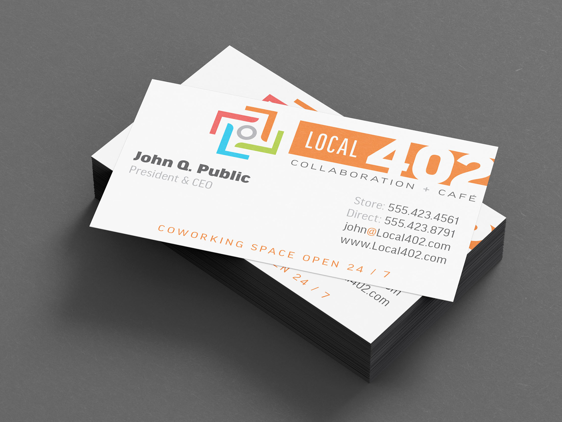
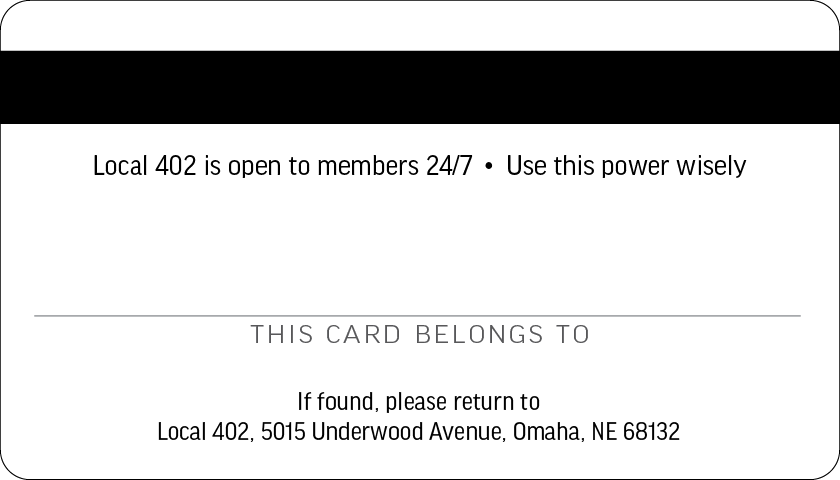
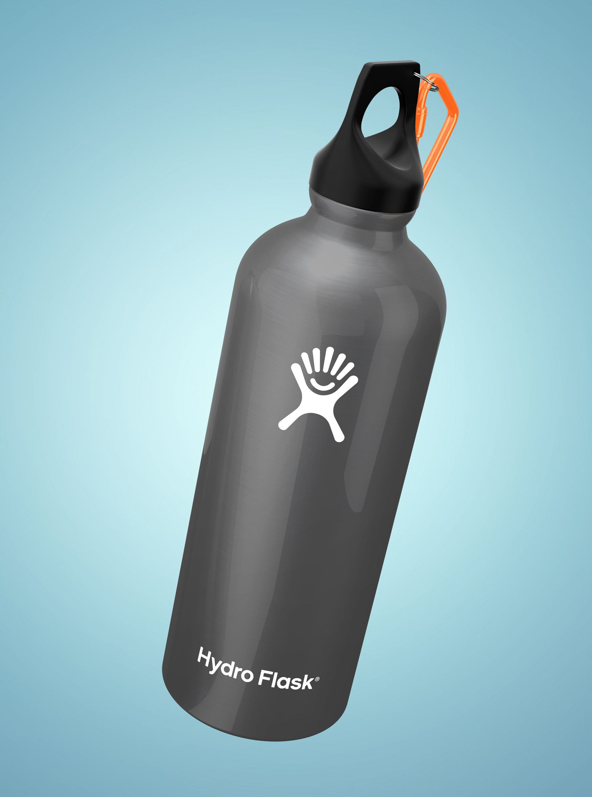
Lots of color options for all sorts of memorabilia to increase the likelihood that a potential client would use them around town. Provides a touch of individuality to an otherwise benign object.