
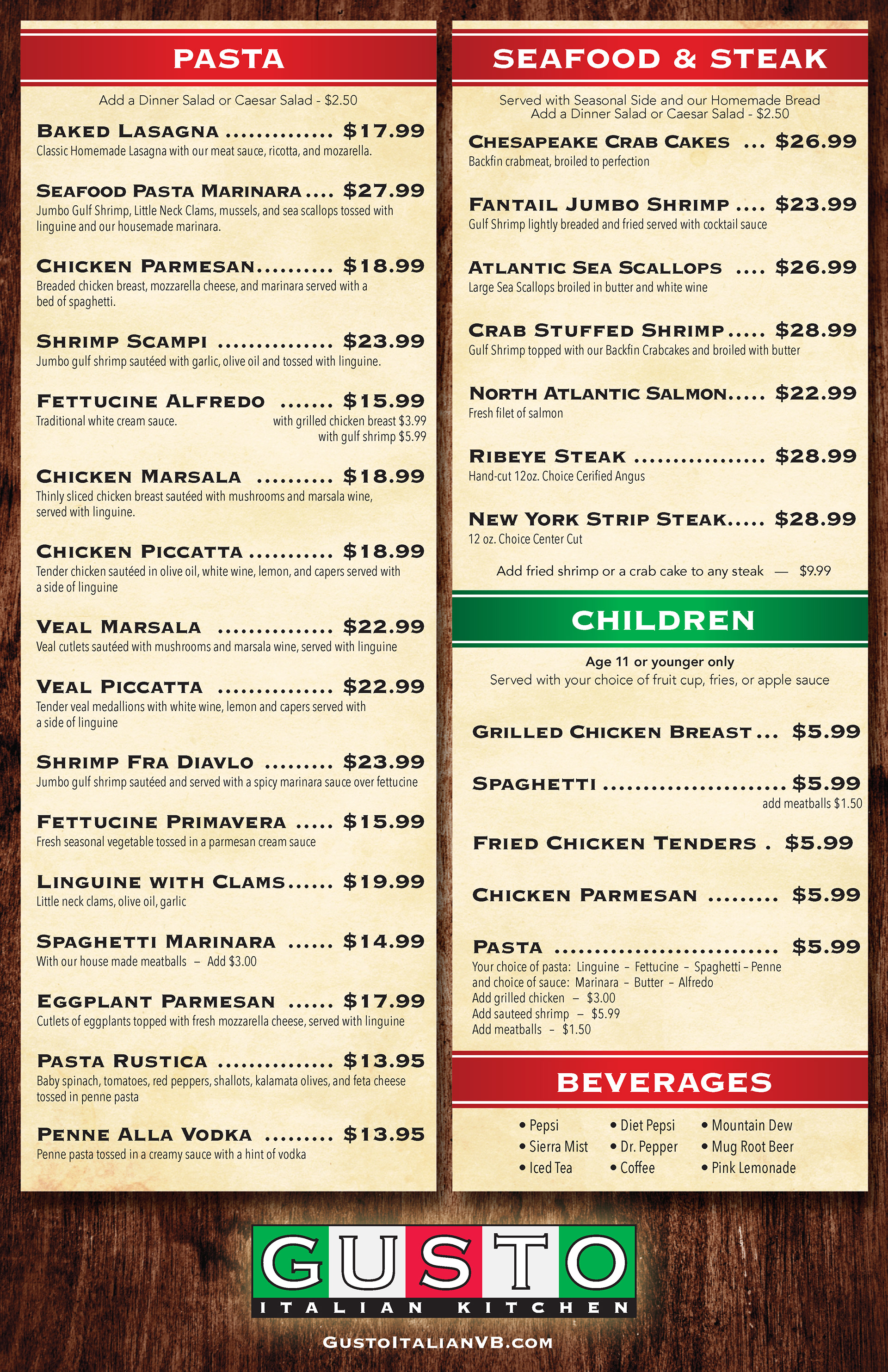
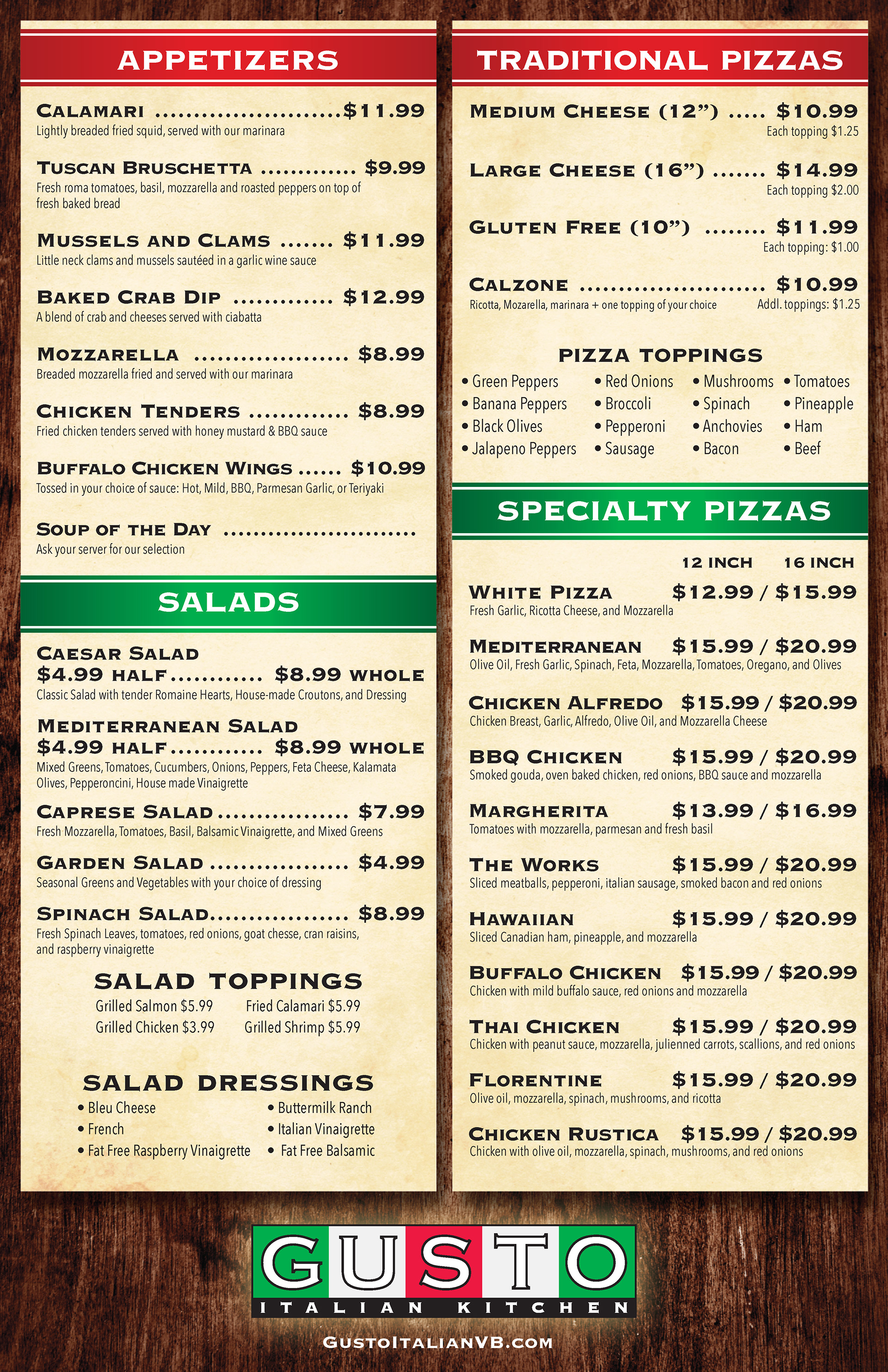
This one is a bit unusual for me. The sheer amount of menu items and selections the client requested meant keeping everything unified stylistically; otherwise the reader could potentially misinterpret one or more listings.
The one trope I specifically tried to avoid was the generic Italian styling. Instead I wanted the viewer to know instantly they are at an Italian establishment, but having a modern take on a rustic type of environment.
The logo that Gusto already had in place utilized Copperplate Gothic, which made for an excellent dominant headline that pairs well with Avenir. I felt the two represented the menu items well -- Italian cuisine often has both bold, boisterous flavors and delicate notes.
Neat little printing caveat: these were printed on a synthetic polyester media that is waterproof, chemical resistant, and tear-proof. No child in the world could ruin one of those menus!
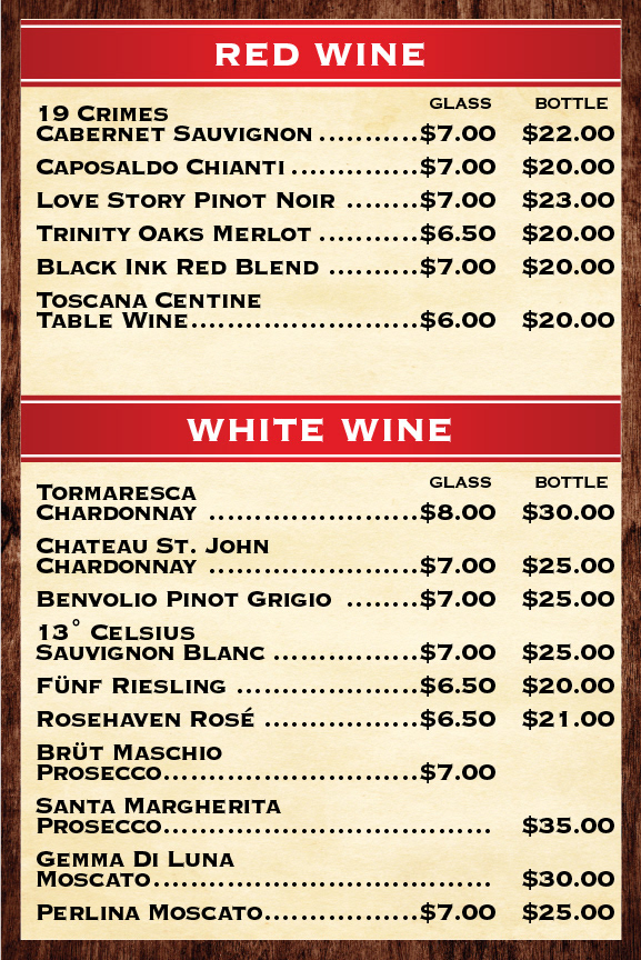
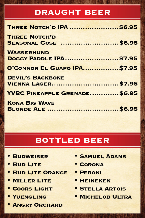
Drink menu cards that sit in the center of each table.